Measures matter.
, .
Have you ever wanted to read a blog post about why dispersion is a much better measure of regional inequality than the coefficient of variation?
What about if that blog post contained lots of graphs and a detailed comparison of regional inequality by both measures in two nations on opposite sides of the Earth?
What if I end by saying that I think that regional inequality in the UK is very high by international standards, and rising?
If you answered yes to all of that, I have good news. If you answered no, maybe you'll say yes by the end.
The coefficient of variation
In The Resolution Foundation's 2019 report on regional inequality in the UK titled "Mapping Gaps" the coefficient of variation is used to calculate regional inequality of household income for different countries. Their choice of measure and their choice of countries for comparison shows the UK to be pretty middling. More unequal than the USA, but not that bad.
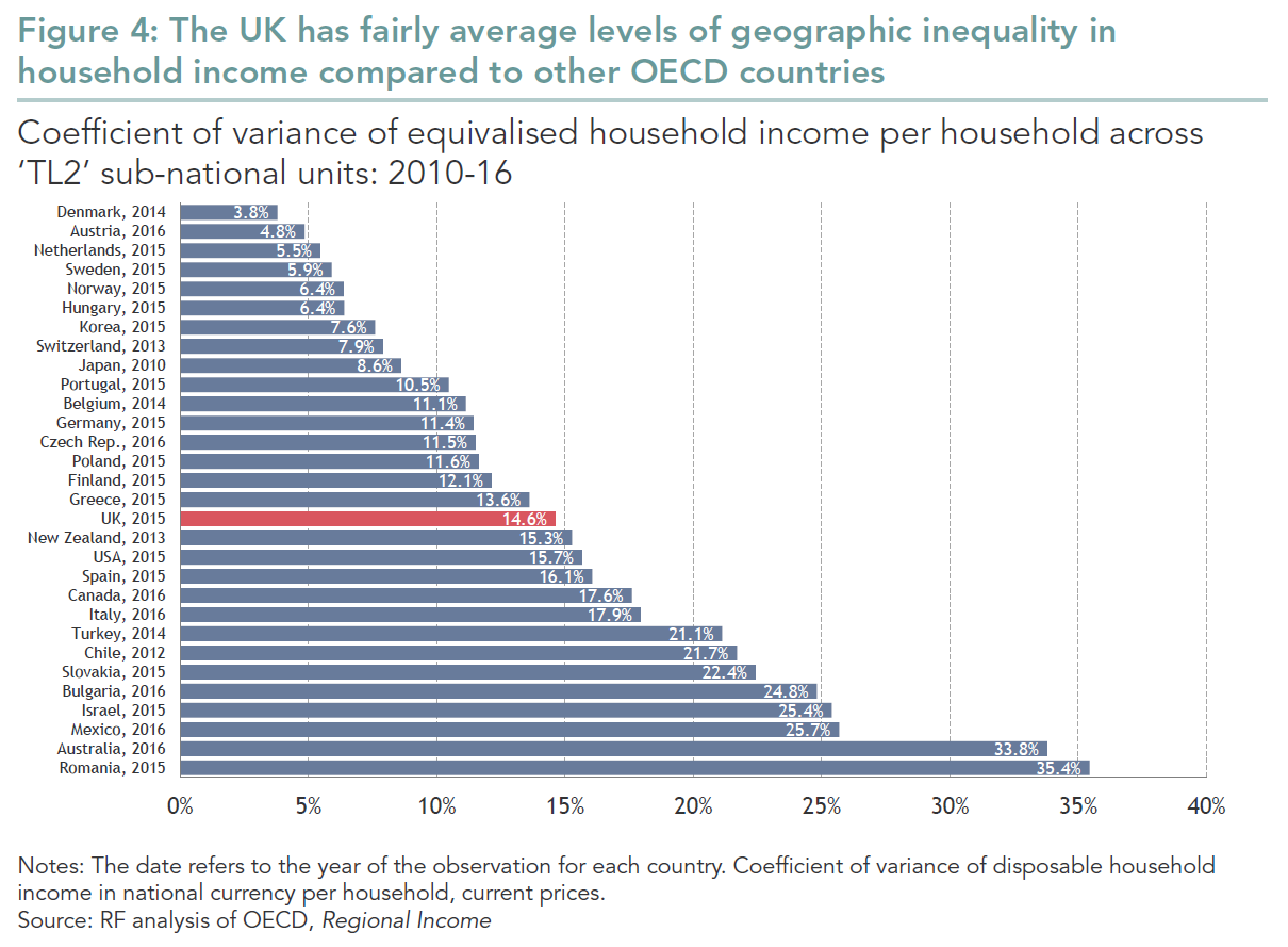
I think that we can do better than this. Let's look specifically at Australia and the UK.
The UK and Australia
In The Resolution Foundation's graph above, Australia has extremely high regional inequality of income. Which was a surprise to me, since most books and papers on regional inequality note how low it is in Australia. What's going on?
Plotting the data shows us. We create a circle for every region of Australia and the UK. The area of the circle is proportional to the region's population. Then we place that circle on a graph according to the average income in that region.
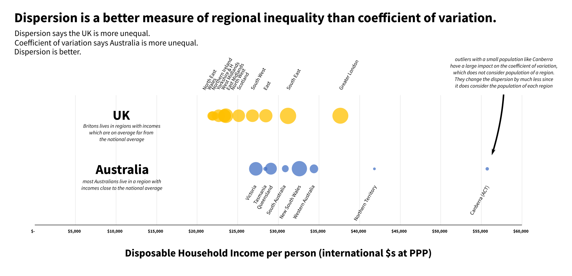
Australia has two regions with unusually high average incomes, The Northern Territory and The Australian Capital Territory (Canberra). But almost no-one lives there. Most Australians live in a region where average incomes are close to the Australian average.
I don't believe that the people of urban New South Wales or Victoria feel much jealousy or resentment towards the very small number of their compatriots living in the more prosperous places, with wages propped up by high mining and government salaries. Nor do I suspect that much sneering flows the other way, certainly not in absolute terms given the small population of both The Northern Territory and Canberra. Size matters.
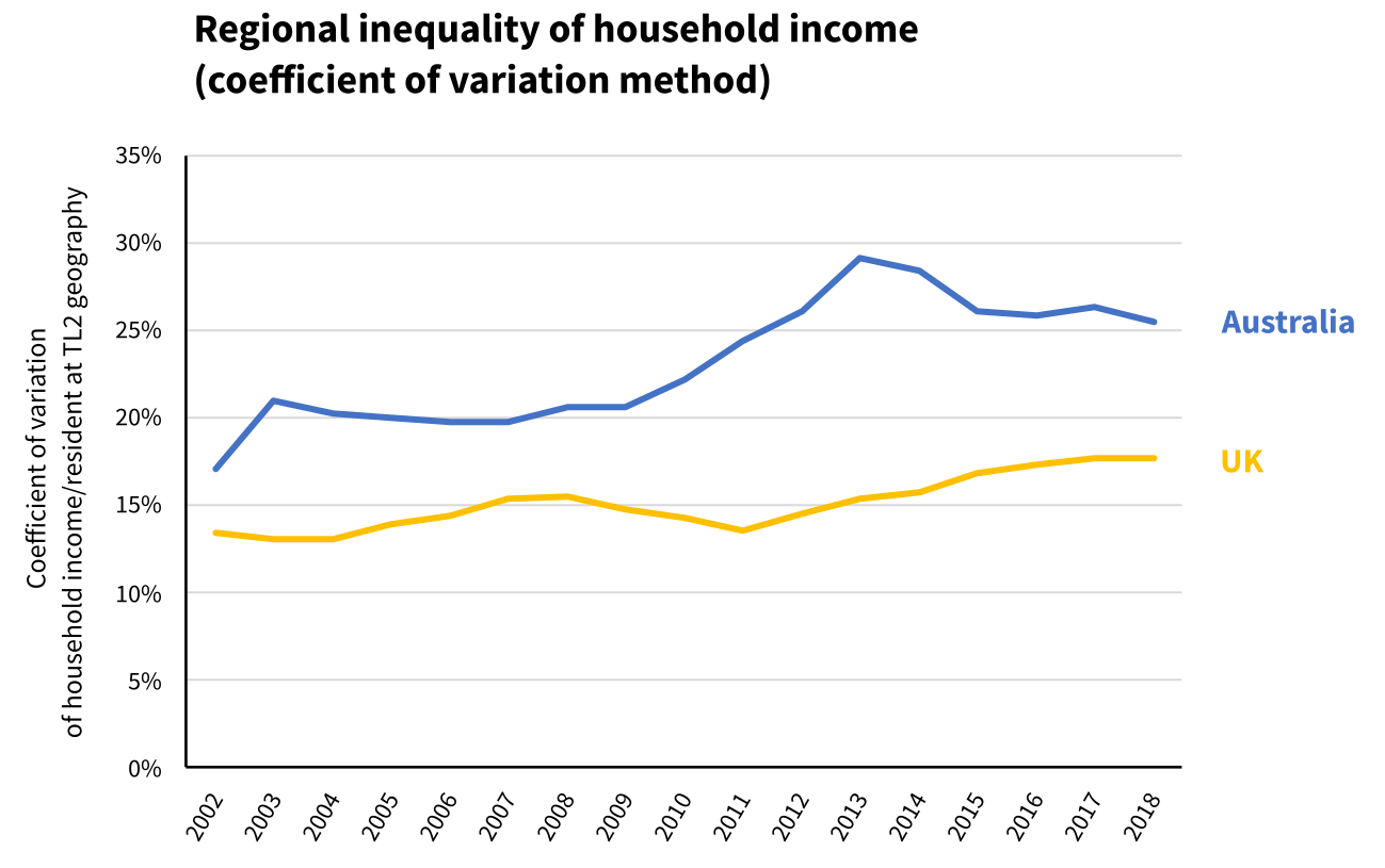
But size doesn't matter when you calculate the coefficient of variation. By the coefficient of variation method, Australia is more regionally unequal than the UK.
Britain is quite different to Australia. Most Britons live in a region where average incomes are far from the British average. A good measure of regional inequality should show that it is lower in Australia. And because dispersion considers the population of regions, it does.
Regional inequality of income as measured by dispersion also shows that regional inequality in the UK has been increasing pretty steadily since 2010. I think this is also true.
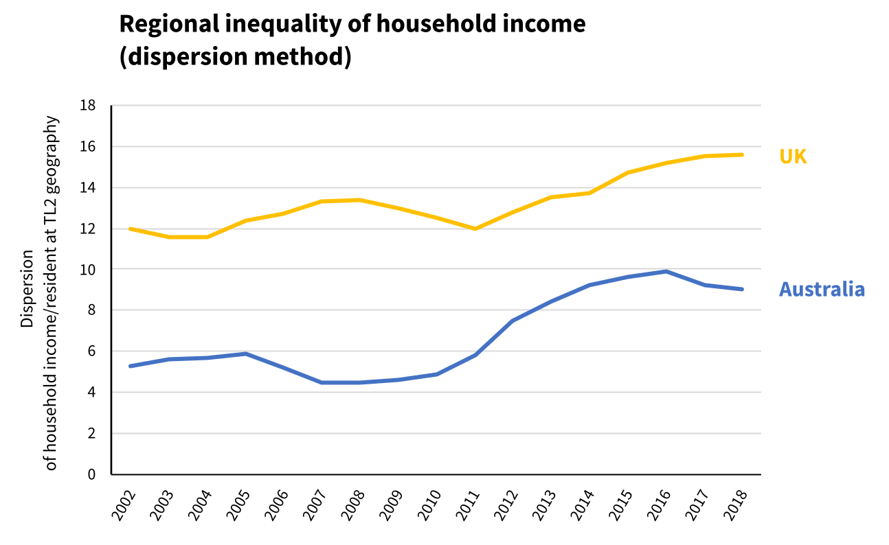
UK regional inequality measured by dispersion.
I think that dispersion is a better measure of regional inequality than coefficient of variation. I hope that I've convinced you.
So now let's look at where UK regional inequality of income ranks by this measure.
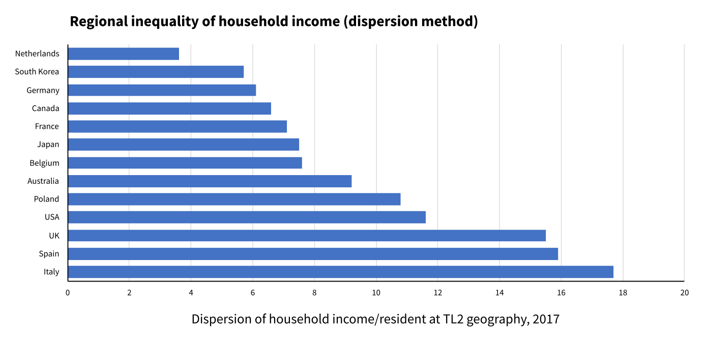
By this measure the UK is highly unequal, along with Spain and Italy.
If you got this far, you may be interested in a blog post I wrote explaining the details of both coefficient of variation and dispersion calculations.
That blog post also explains why I prefer dispersion of GDP to dispersion of income when quantifying regional inequality. You may be interested in my summaries of that work on regional inequality in Europe.
Or maybe you just want to see bubble charts like the one for the UK and Australia above but with lots of regions of lots of countries, including the USA, to get your own feel for regional inequality.