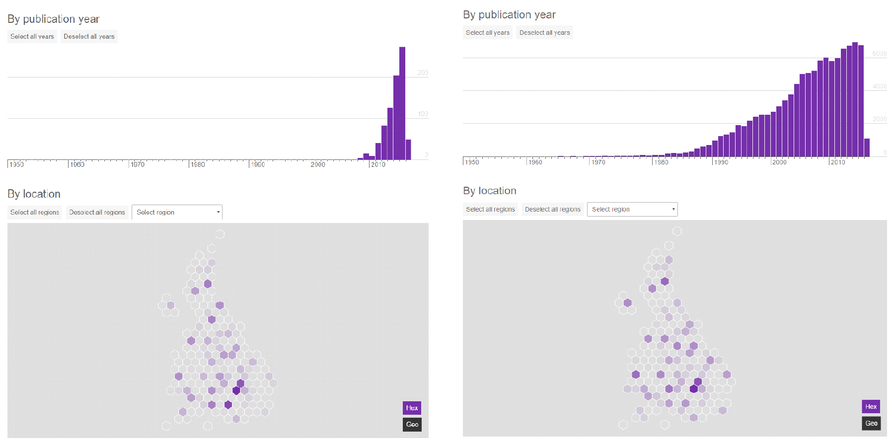
The evolution of clusters of research excellence measured with The Microsoft Academic Knowledge API preview.
Juan Mateos-Garcia at NESA recently shared one of the best summaries of the current state of measuring science output . He calls the field scientometrics and here I’m sharing some recent work that I’ve been doing to add to it.
The Microsoft Academic Knowledge API
I’ve been using The Microsoft Azure Cognitive Services Academic Knowledge API Preview (try saying that after a few drinks) and it’s really impressive. Microsoft have ingested millions of scientific papers, extracted a lot of information from the text (names of Authors, Institutions, Year of Publication), used Machine Learning to guess others (Field of Study) or to categorise variable names for the same Authors and Institutions into a single identifier, and then put it all in a database that you can query. The first few hundred queries are free, but after that you to pay, but it’s very affordable.
My suspicion is that the underlying structure of the data is a graph database, focusing on links between papers, institutions, authors, and fields of study. As a result, the query syntax is unusual. And to make matters worse, there aren’t a lot of examples. But it’s worth the effort and hopefully this will serve as an extra example for people to follow
The database feels enormous and server responses are near-instant. I learned the hard way that there’s a required 10 second gap between requests, though I’d expect this to be removed once the service leaves preview.
Measuring the emergence of scientific excellence
I started with a list of 154 UK research institutions, created from the list of institutions measured by the research excellence framework (REF).
I created a list of areas of field of research from the UK’s Digital Catapult Centre’s seven fields of interest. These were advanced manufacturing, artificial intelligence, augmented reality, big data, computer vision, health informatics, internet of things, machine learning, and virtual reality. And then I ran 9 times 154 (1386) queries asking about the publication record of each institution in each field of study over the past decade. The request URL looks like this.
https://westus.api.cognitive.microsoft.com/academic/v1.0/calchistogram?expr=" + "And(Composite(F.FN='" + fieldOfStudy + "'),Composite(AA.AfN='" + researchInstitution + "'))&attributes=Y&count=100
You need to include an API key in the request header, but if you do that then the above command will get you a histogram with a count of papers in the fieldOfStudy published in each of the last 100 years where at least one of the academics was affiliated with the researchInstitution.
It’s a very rich graph database and a very powerful query language and in the two days that I spent playing with it I felt that I was just scratching the surface. The natural-language query builder was extremely useful.
Checking the results
I think that visualisation of this kind of data is essential to check that it’s correct. A lot of people disagree with me on that, but I’m more and more convinced of it. I’m pretty sure that the University of South Wales over-achieves in this data because Microsoft’s machine-learning approaches conflates it with the University of New South Wales. That’s obvious from a visualisation. In my related recent work with Meetup data it was visualisation that highlighted the problem with all of London’s events being listed in surrounding cities and skewing previous
But as well as checking for errors, visualisation of this kind of data is useful for making sense of it. It lets people ask better questions and hopefully make better decisions based on the answers.
So we’ve created our first try at a visualisation of the results of our analysis. It shows the geography of different disciplines, and how that geography has changed over time. It borrows a lot from our recent report on the Internet of Things innovation ecosystem in the UK .

Ultimately the results from this research are simplified to a single number for each city and each field of interest. This number provides one component of the scoring system for technology clusters that I use in a report and web tool on this topic.
What’s next?
Now that I know what’s possible with the API, I know that we could do even more interesting stuff. We can ask questions like,
- What role does researchers moving around and collaborating play in the development of clusters?
- How do new scientific clusters start and how quickly do they grow and spread?
- What researchers populate new fields as they are created?
And with more time I think that we could produce extremely powerful visualisations that uncover very useful patterns in the data. These should inform where we spend money on science, what we incentivise in researchers, and help us decide what skills to train and attract if we want to succeed. Plus many more interesting questions that we don’t really know how to answer at the moment.
All of this is something that I’m hoping to talk to people about soon, including the team at Microsoft Research. If you’d like to join in, or have opinions on where we should take this, please let me know. We share because it helps us learn, and we have a lot to learn about in this area.